Sticker Quest: Daily Sticker Adventures
Game Design, UI/UX Design, Graphic Design and Animation
Everyday a New Adventure!
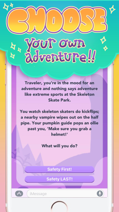
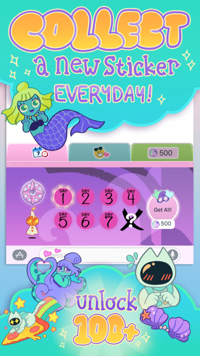
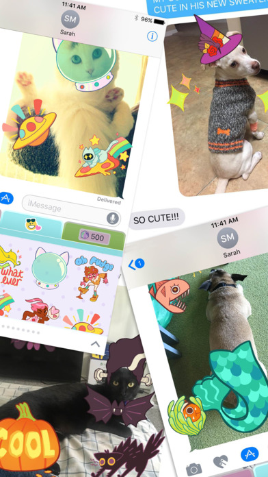
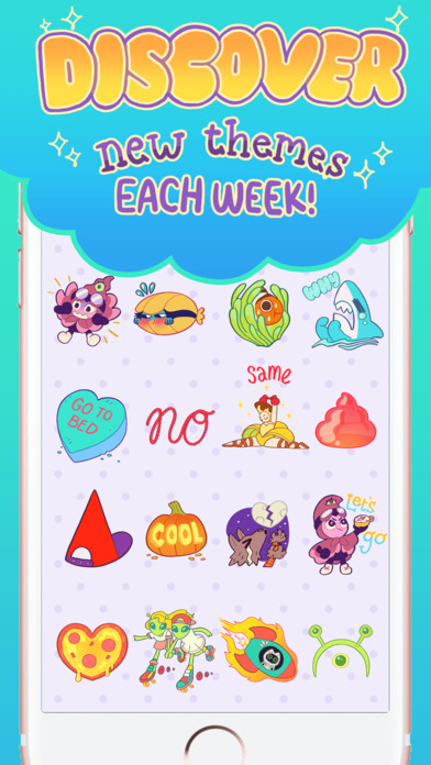
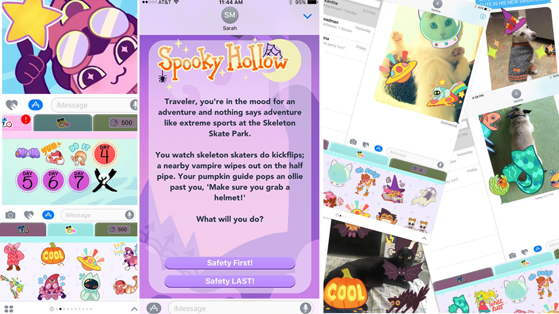
Sticker Quest is a tiny, daily choose-your-own-adventure developed for iMessage. Each day when the player enters the app, they get to make a choice about the way they explore the world at hand. Based on their choice, the player gets a new sticker!
Stickerquest was developed in 6 weeks by a small, dedicated team of developers. I worked as the UI Designer and Artist, and weighed in on UX design and motion design. I also partnered up with engineering and implemented some of the UI in the game using Xcode.
Stickerquest was featured by Apple in their “New Games we Love!” section in the iMessage App store. It was a top game in the iMessage App Store, until Nix Hydra removed it in 2018 as part of their rebrand.
Design Goals
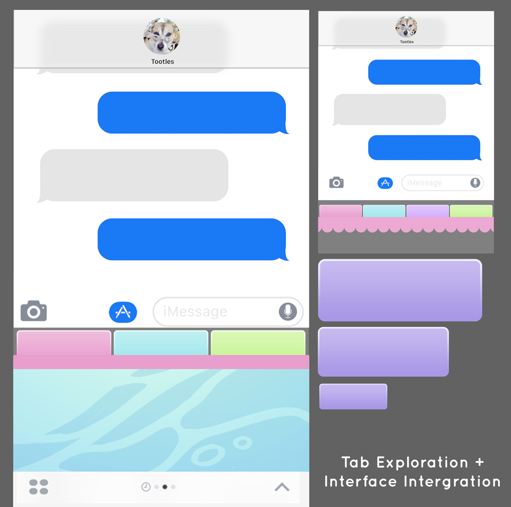
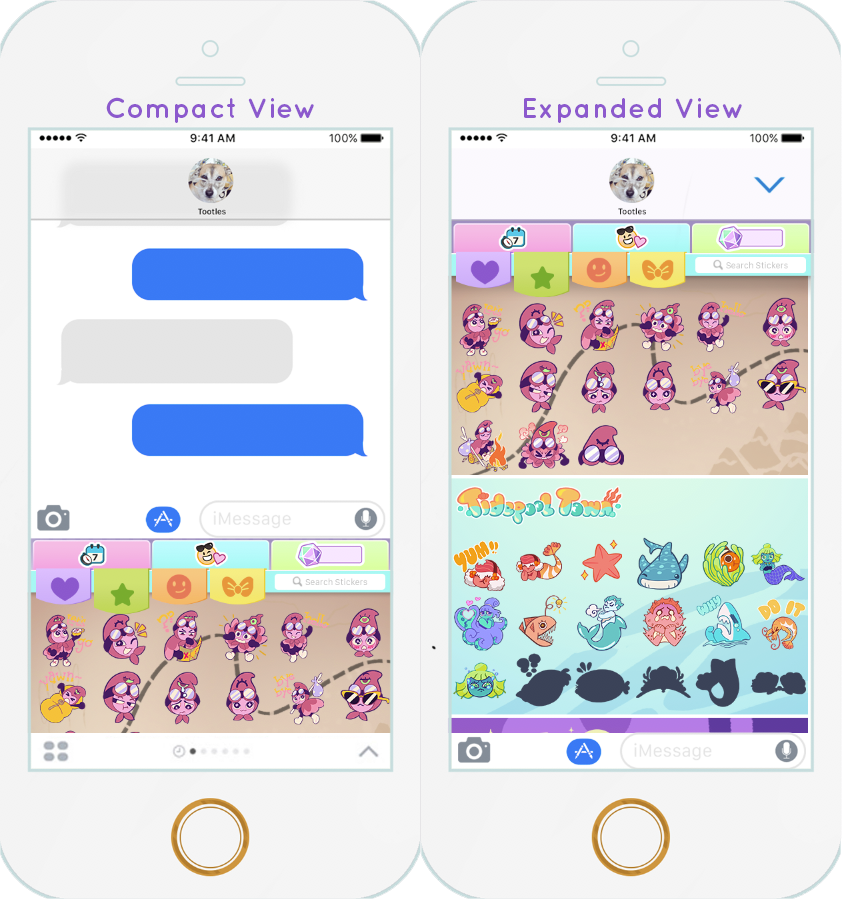
Developing a game in six weeks is a challenging experience. As the UI lead my primary concern was making sure our game, which would be housed inside Apple’s sleek iMessage interface, complied with Apple’s User Interface guidelines while still maintaining its own identity.
We were designing this app as the new iMessage App functionality was being announced. I worked with the dev team to make sure we were up to speed on the new development guidelines released from Apple in order to complete our app in 6 weeks.
I built my design on a strong foundation that Apple and iOS users would immediately recognize and understand. I like to think of User Interfaces as a language spoken through layouts, gestures and design - a principal I kept close to heart working on this app. I wanted players to immediately know the dialect, even if they had never played this game before.
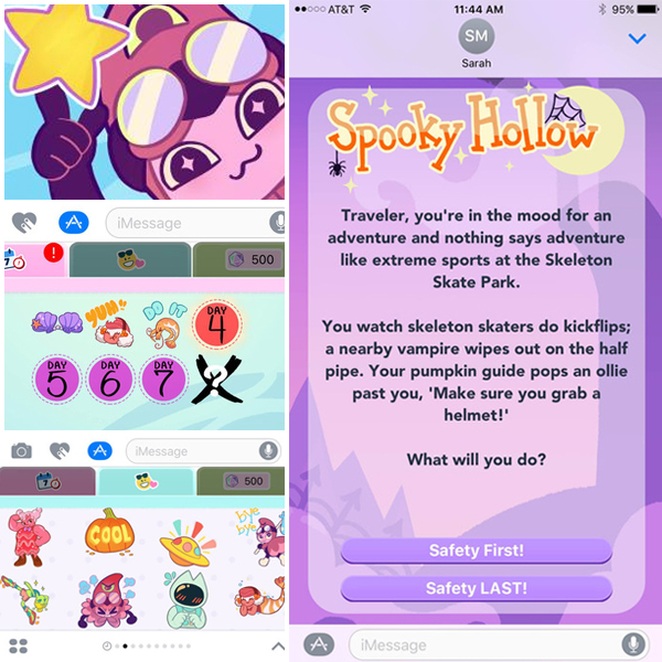
Design Process & Inspiration
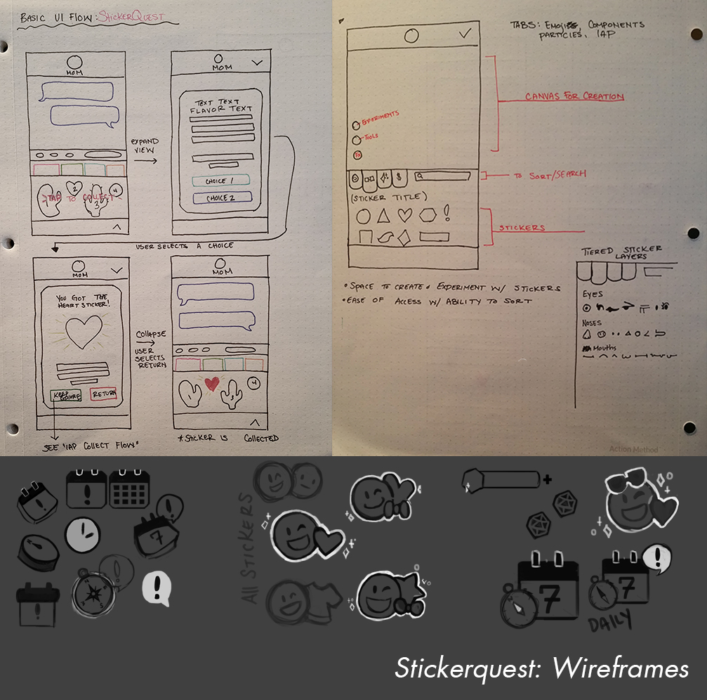
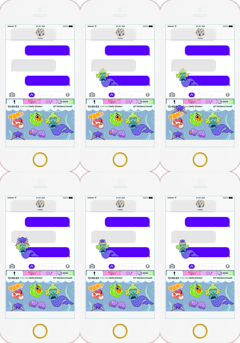
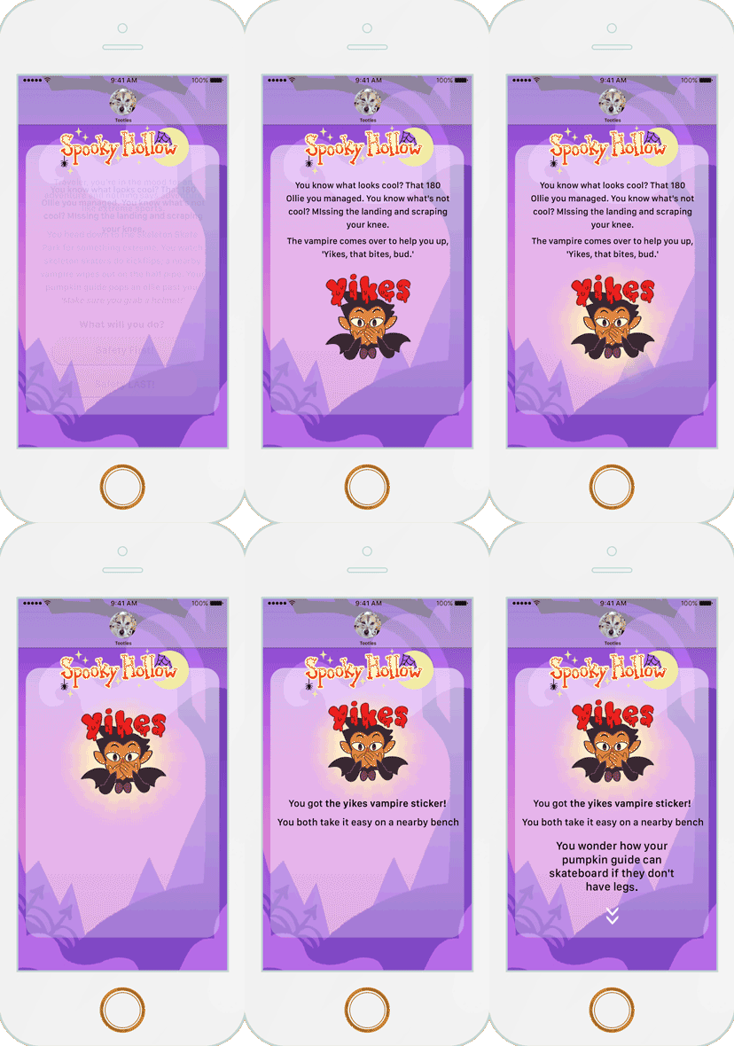
I did a lot of wireframes and prototypes for this app as we continued to figure out how things worked inside iMessage app container.
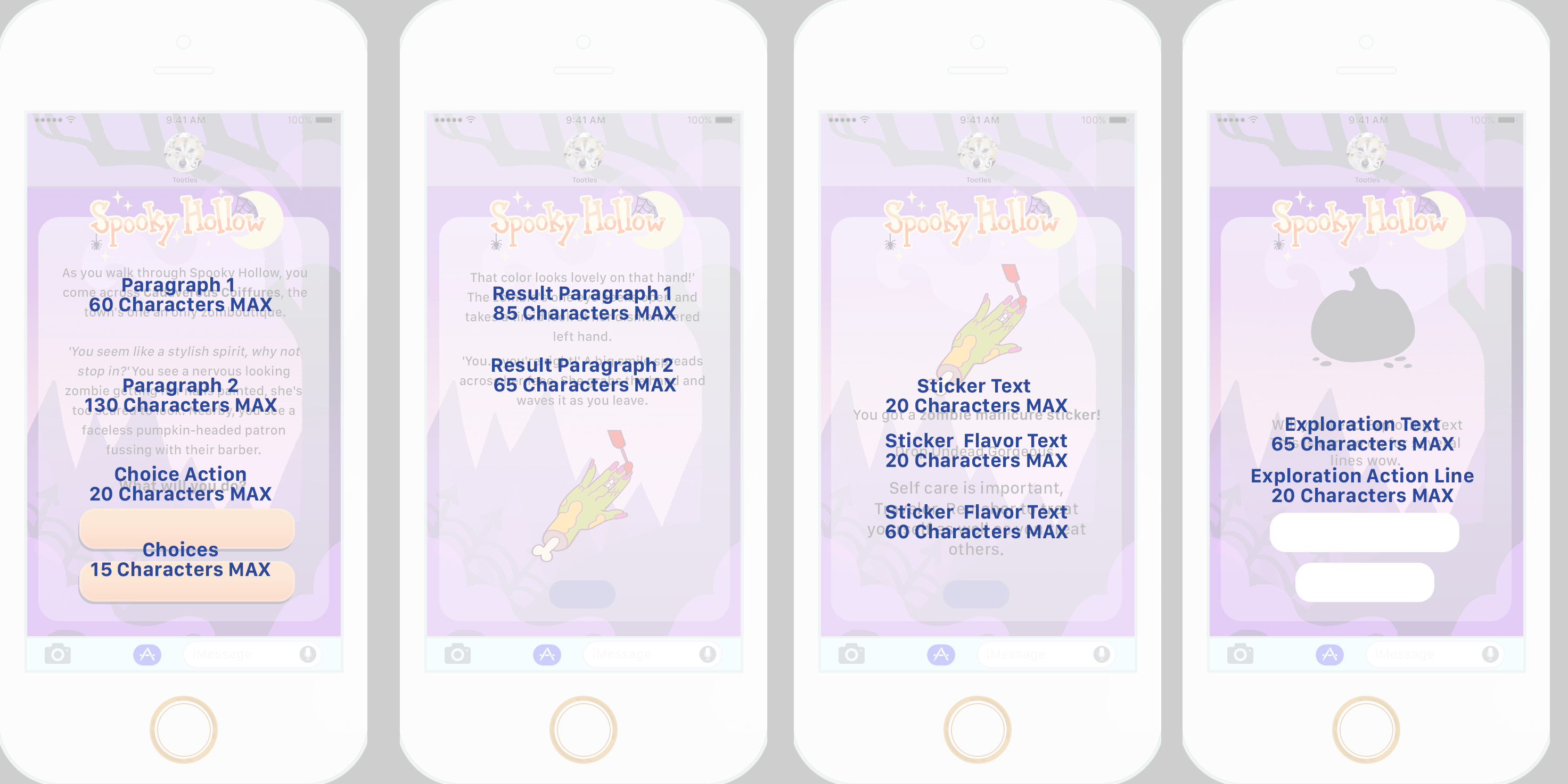
This game was designed to be a brief, daily delight that players could indulge in for a moment- while unlocking a fun new sticker to use in their messages. With this in mind I focused mainly on the choice interface so that it felt intuitive and at home in iMessage.
In addition, I did several motion mockups in After Effects to help our team figure out the best way to approach animation for this app.
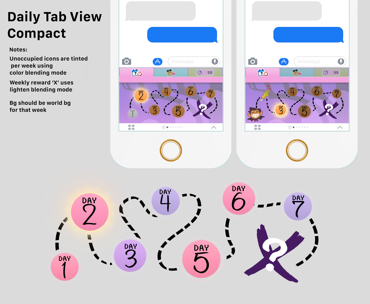
Since our app would be housed inside the immaculate iMessage interface, I didn't want to stray too far from the iOS visuals, but I looked at the aesthetic of sticker photo apps and Purikura (Japanese photobooths) for my inspiration. I wanted the style to be overall colorful to match our artist’s sticker designs. Since our backgrounds would be changing weekly depending on the world our player was in I needed my assets to be adaptable to different color schemes – either through nice neutral tones, or by tinting the assets on a case by cases basis.
Sticker Quest was released in May 2016 on the iOS iMessage Store. It was one of the first games released as an iMessage app and was featured by Apple as a "New Game we Love!" It remained a top charting iMessage app for several years.
Ultimately the game was removed by Nix Hydra during their rebrand in 2018 to fully support their visual novel titles.
Take a look at Another Project!

Gaming the System: Marketing as a Game DesignerGame Design and Marketing

PuzzlescapesUI/UX & Game Design
Charm King Screenshot Redesign (2019)Graphic Design & Branding Case Study
Signs of the Sojourner TrailerTrailer Editing and Design
Artwork & MerchandiseGraphic Design & Illustration
Sticker QuestUI/UX & Game Design

Atomic Lollipop Convention PromoTrailer Editing and Design
Appstore AssetsGraphic Design & Marketing
POV Entertainment AdsGraphic Design & Motion Design

The Arcana - TrailerTrailer Editing and Design

Style and Branding GuidelinesBranding and Marketing
