Fixing the Funnel :
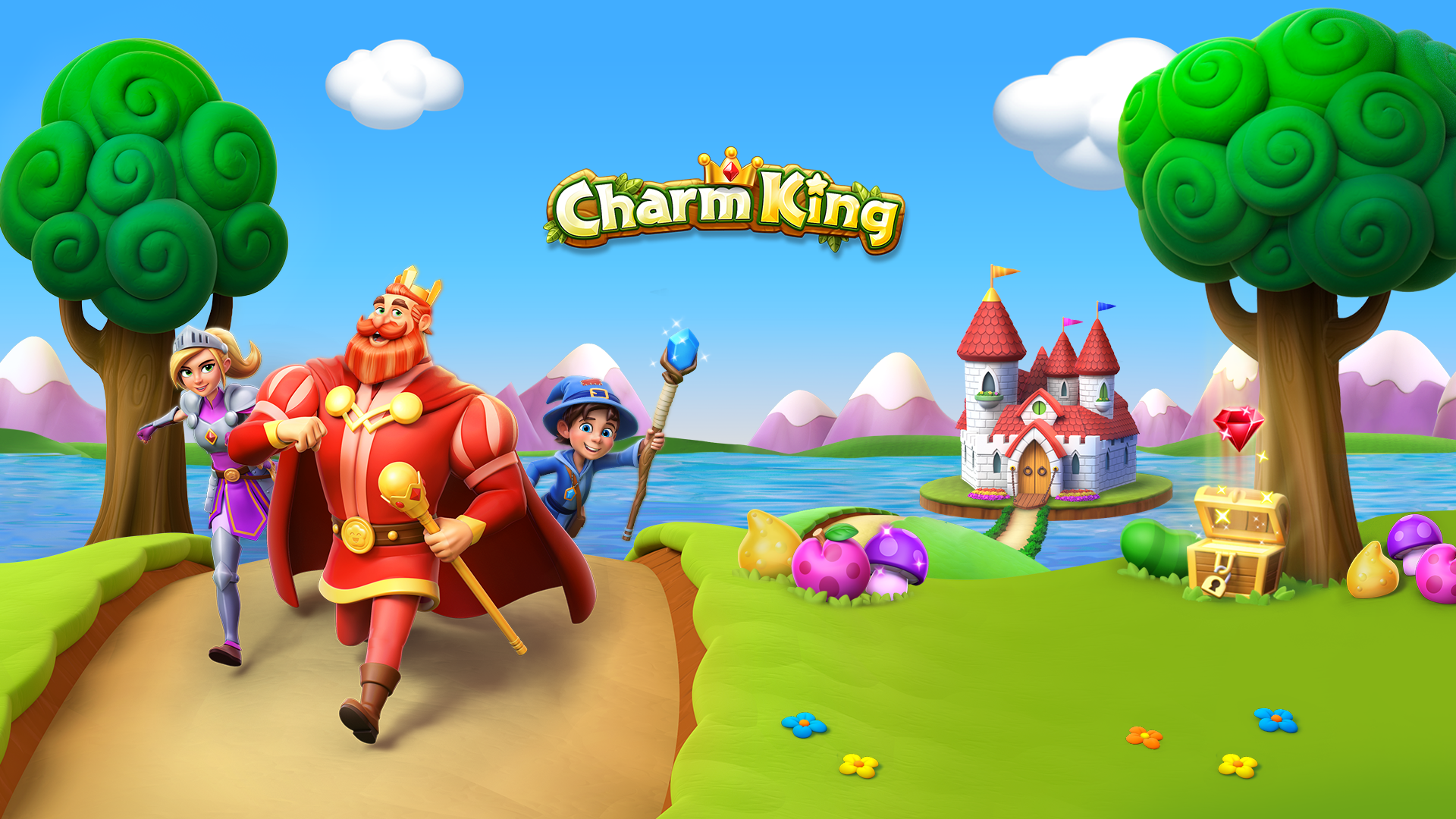
Charm King Screenshot Redesign
Identity Design, Marketing Art, Graphic Design & Production Stategy
In April 2019 - Charm King released a massive new update featuring updated designs for their IP characters, a revamped map and new gameplay. To prepare for this update, an all new set of screenshots were designed.
After the new screenshots were implemented, we saw performance improvements across campaigns as our new brand facing screenshots fixed a vital gap in our conversion funnel.
A Second Chance at Screenshots
In January 2018, a year before we started this screenshot project, I was asked to do a quick pass at the Charm King appstore screenshots with the goal of replacing our outdated art with some of the new in-game characters we had been leveraging in our ad campaigns. Unfortunately this 'quick pass' ended up being a lengthy process filled with many challenging moments.
While the new designs aligned well with our UA campaigns they were not as coherent with the content in game. I also was ultimately unsatisfied with the clarity of my designs.
As a designer, its rare you get a second chance to revist a large project and improve it. But in January 2019, we were given the opportunity to redeem the appstore. I was eager to work on the project to bring our brand back in alignment and design a cohesive experience that would lead our players from our UA ads to our game content.
Planning and Sketches
In 2018, the User Aquisition and Creative Services team were split - with little cross-functional collaboration. UA issued the brief for the screenshots, but offered little input on what the actual content should be. Creative Services had very little visibility into what performance goals should be met with these screenshots.
I worked very isolated from the team - which limited my final designs to my own creativity and perspective. Ultimately I think this lack of cross-discipline collaboration is what resulted in our intial designs failure.
However mid-2018, I worked very closely with UA to begin integrating our teams together. I wanted to educate all the artists on my team (myself included) about performance metrics, and believed that having artists working closely with our UA managers would reveal solutions and ideas that were both performant and creative.
When we tackled this new round of screenshots, we began from a place of collaboration. I worked closely with the Marketing Manager on UA to create a plan that covered planning, initial sketches, executive approval, execution & localizations.
We began in our cross-functional team brainstorm by examining competitor comps and determining what features we wanted to show in our screenshot lineup. I then worked with my lead marketing artist to sketch thumbnails.
Ultimately, we picked 4 screenshot designs: Gameplay, Tales Feature, Events Feature and Competitive Feature.
Final Sketches & Getting the Executive Sign Off
One of the challenges we faced in 2018 was that feedback for the screenshots kept trickling in through all stages of the process. It would be easy to say we had too many cooks in the kitchen and a bad case of design by committee - but in this case I was the one to blame, I let the cooks in by continuing to address these small notes, instead of just getting everyone together and collecting the feedback.
For this pass at screenshots, I wanted to insure all stakeholders had input into the process , but wanted to improve visibility by limiting feedback to clear touch points and meetings. I hoped with this process we could save the stakeholders time & allow them to share feedback with each other, improving with collaborative discussion lead by the Creative Services Team .
I presented two screenshot lineups to our main Charm King Stakeholders - the CEO, CPO, Art Director and VP of Design. In this deck I also included all our compeitive analysis, original sketches, and lineup sketches.
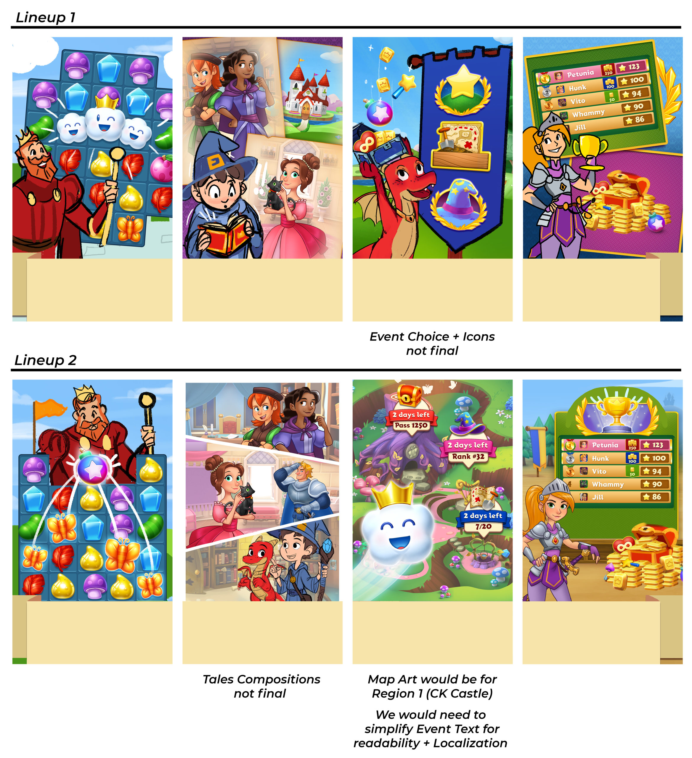
Ultimately we decided to mix and match these two lineups and incorporate some additional UI elements. I presented the revised lineup to the stakeholders the following week, and received approval to bein producing the final screenshots!
Dreams of Ribbons and other Text Containers
One of the biggest regrets of my 2018 screenshot designs was the text styling and container. In a moment of weakness I allowed myself to warp the text, knowing full well it would have to be localized in over 13 languages. Let's just say I severely underestimated how awful dealing with that two line warp in Norwegian would be.
For the 2019 designs I swore off warped text, but wanted to keep the idea of a wave that flowed across all the screenshots - tying them together and encouraging the user to scroll through the whole lineup. I ended up designing a simple ribbon that mirrored our in game UI with a ripple that alternated across the lineup.
I built the ribbon modularly with linked smart objects, so I could easily swap it out and adjust it for all the different screenshot resizes. I filled the area below the ribbon with white so the screenshots would appear 'masked' in the appstore - following the ribbons shape.
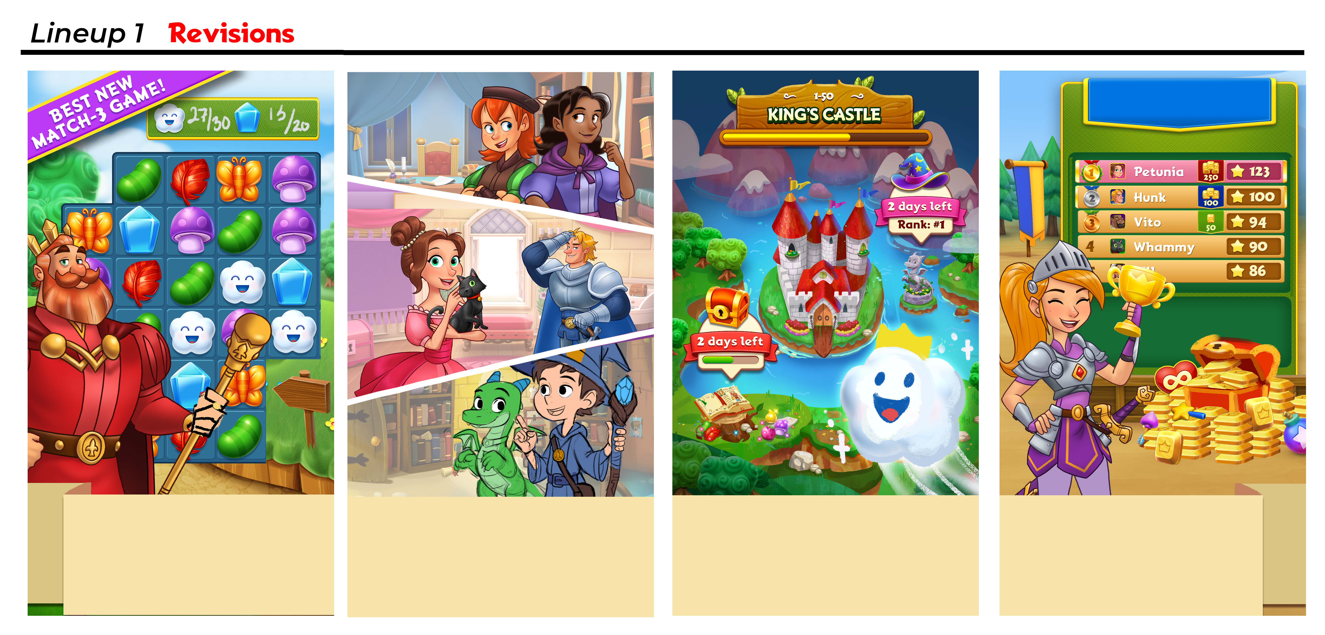
Screenshot Designs & Comparison
Comparing the final designs from these two lineups reveals the improvements we made in clarity, brand cohesion and overall design quality.
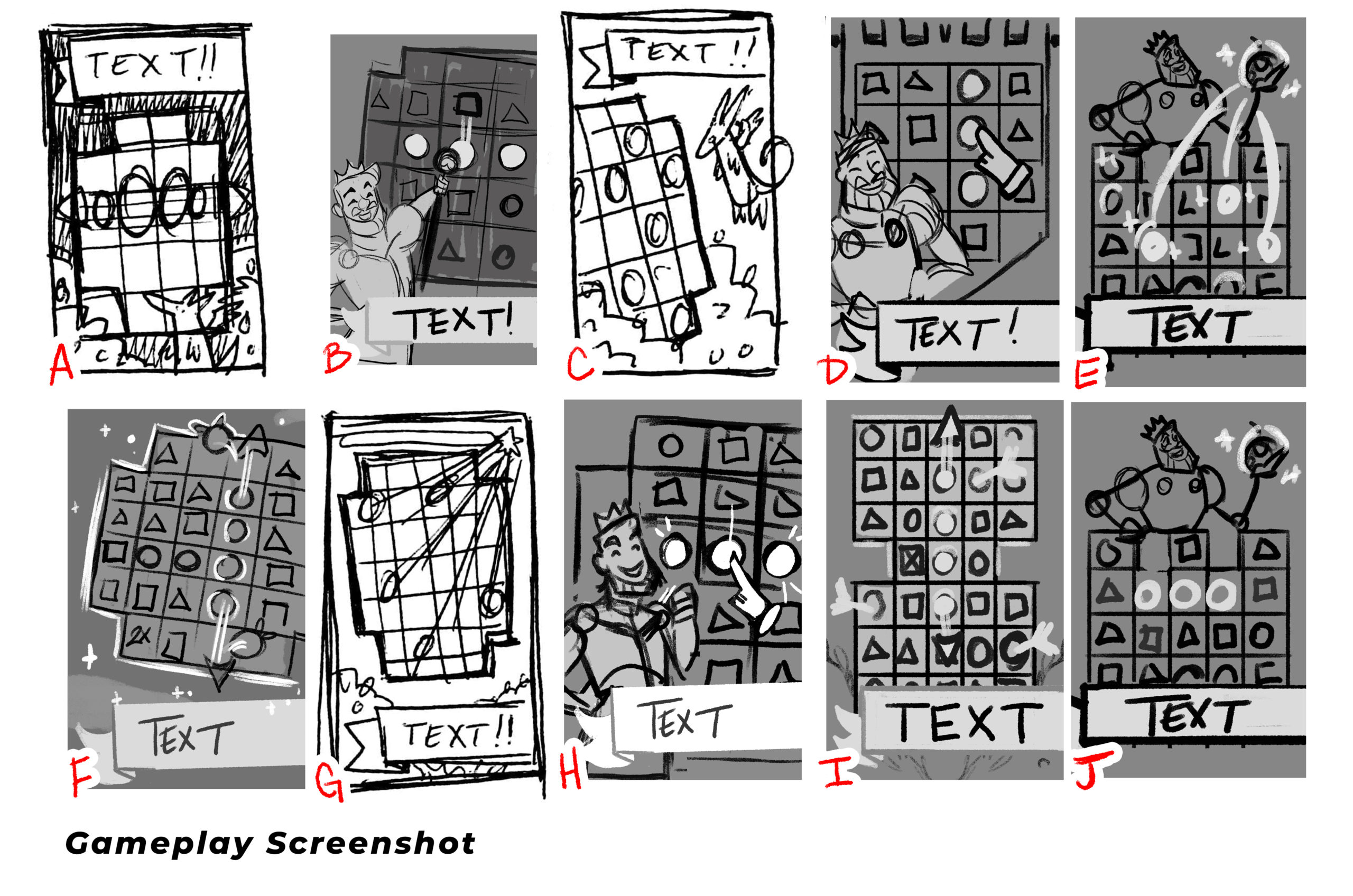
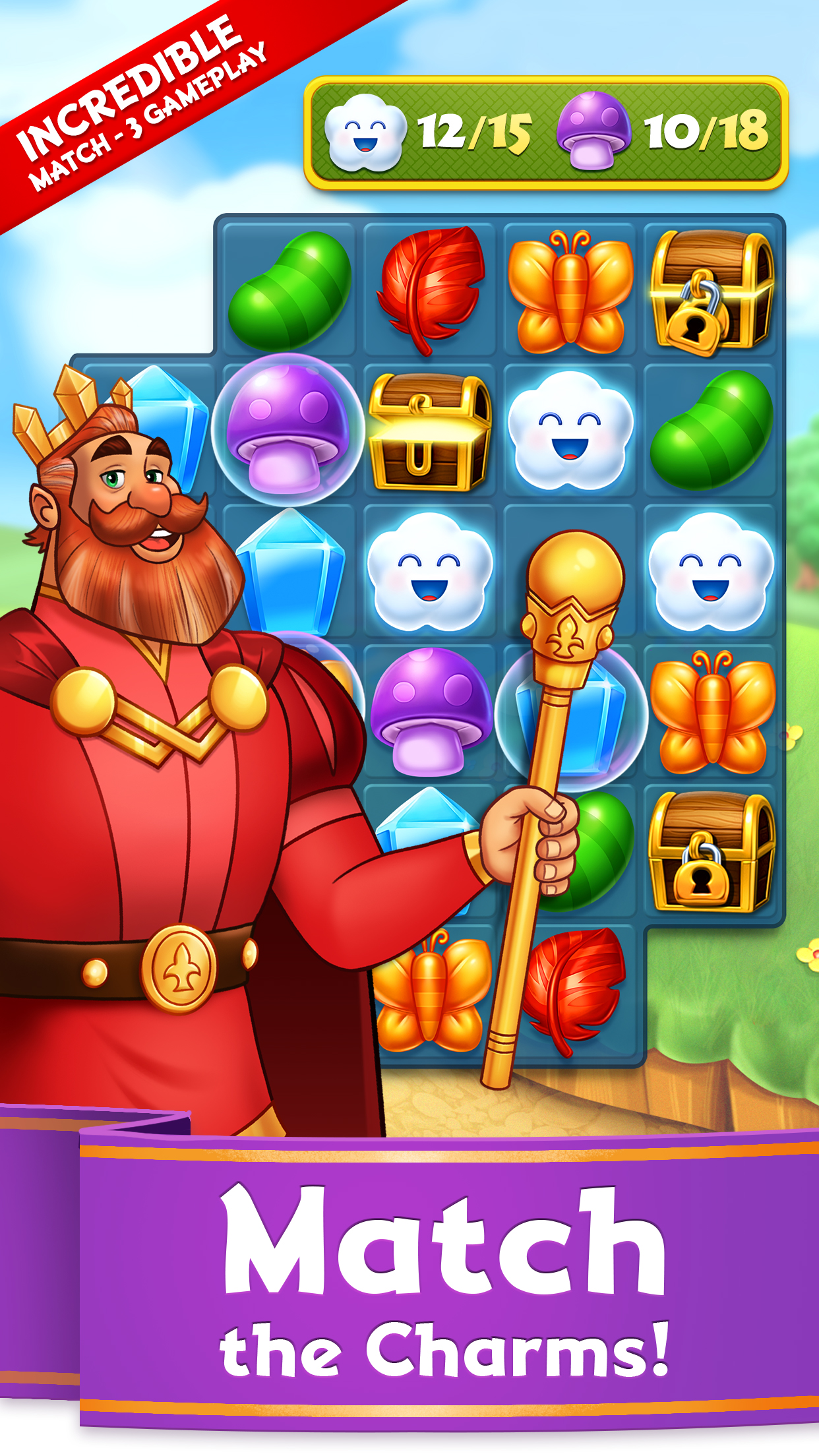
Gameplay
The challenge with the 2018 design is clarity. Without the context of our gameplay, the scroll does not seem particularly enticing. The closeup board and in-progress enchant match does not reveal what type of game this is. Finally the copy is unclear, what exactly is a tale and why should the user care?
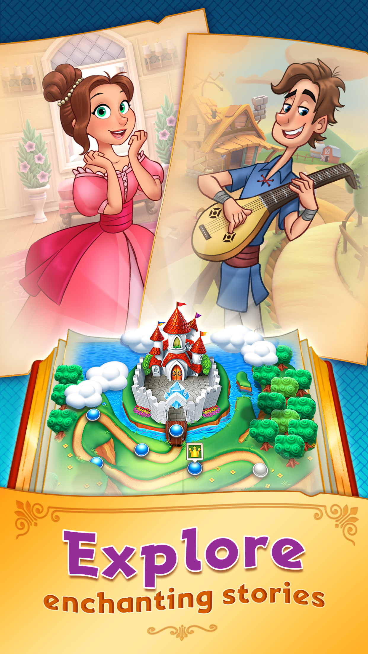
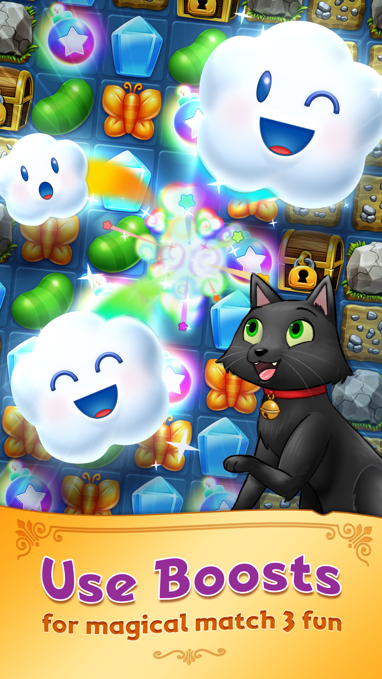
With the updated design, I focused on a simple gameboard, featuring the titular Charm King. I included the target UI element as well, showing a clear match and collection element of our game. We also included the ribbon calling out the gameplay style in the top to make it clear that Charm King is a match 3 title.
2018 Gameplay Screenshot
2019 Gameplay Screenshot
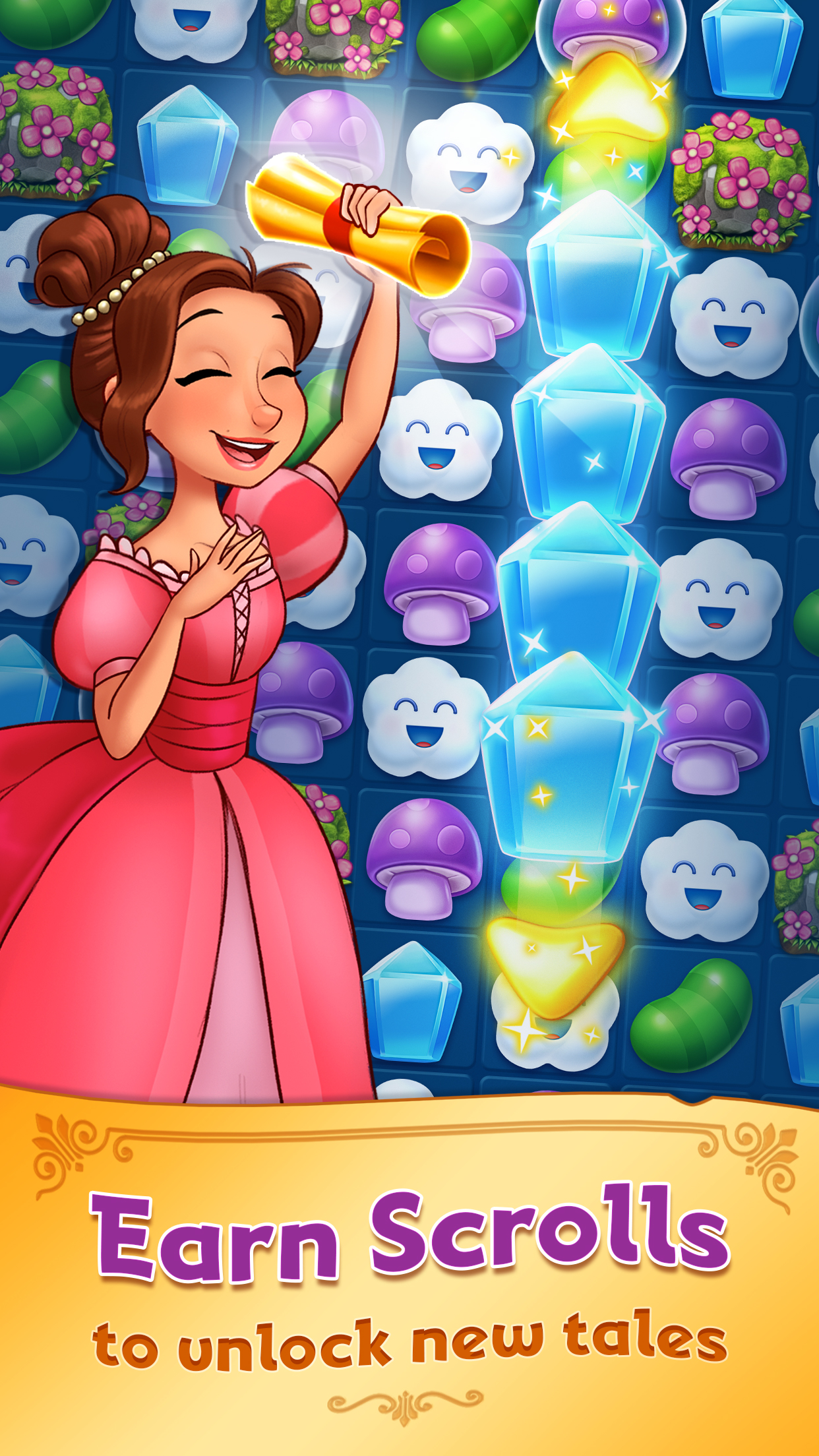
Tales Feature
The design from 2018 is also unclear and a little juvenile with the popup book design. The character pages show these Tale characters in a story environment, but other than that we don't know too much about them.
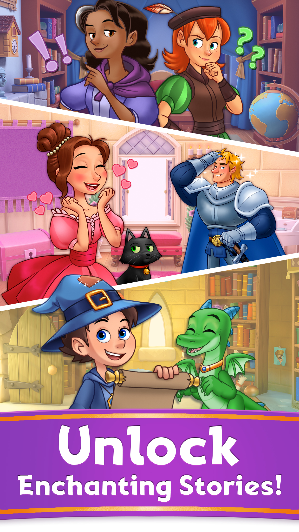
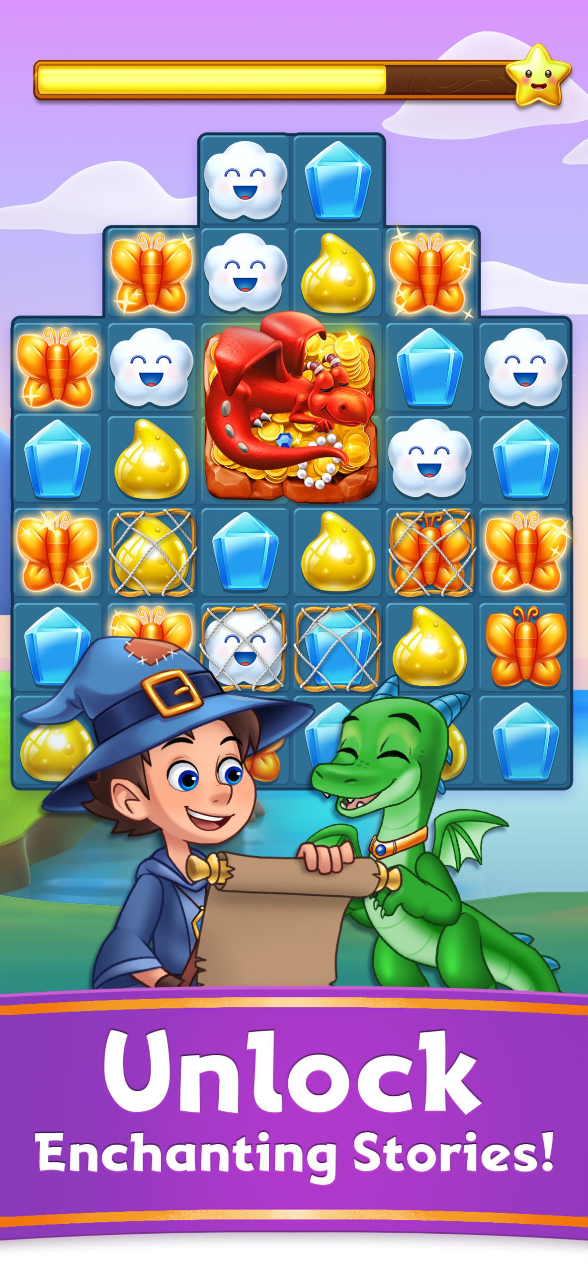
For the 2019 design, I took inspiration a from more narrative driven competors, such as Episodes or Choices. This design highlights characters as well as interactions, emphasizing the best part of Charm King's tales - the stories! The copy was revised from "Explore" to "Unlock" - the latter being a more active verb showing the clear progression in Charm King.
2018 Gameplay Screenshot
2019 Gameplay Screenshot
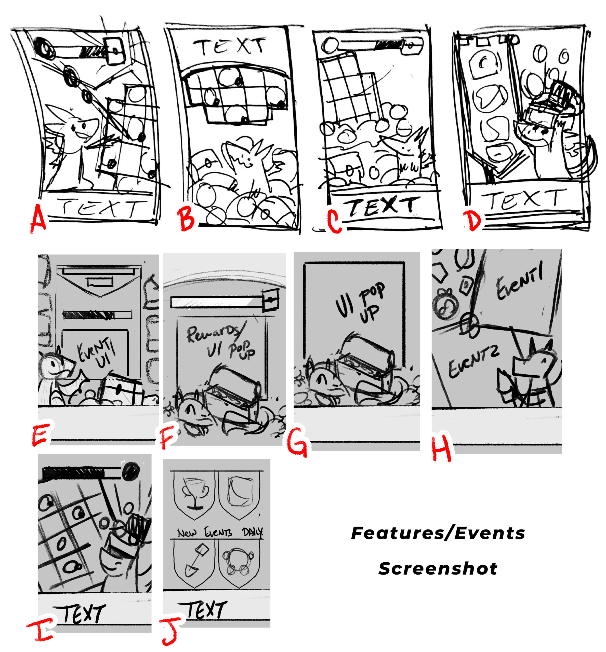
Features: Events
The 2018 design showcased elements from one of our ingame events - Treasure Hunt. Of course you would not know this if you hadn't played our game before! While the copy on this screenshot is very descriptive, it does not pair well with the imagery.
For the 2019 design, I highlighted one of the new features in Charm King - a completely redesigned map experience. Showcasing the map with various event nodes mimiced gameplay experience. We also updated the copy to highlight our now Daily events.
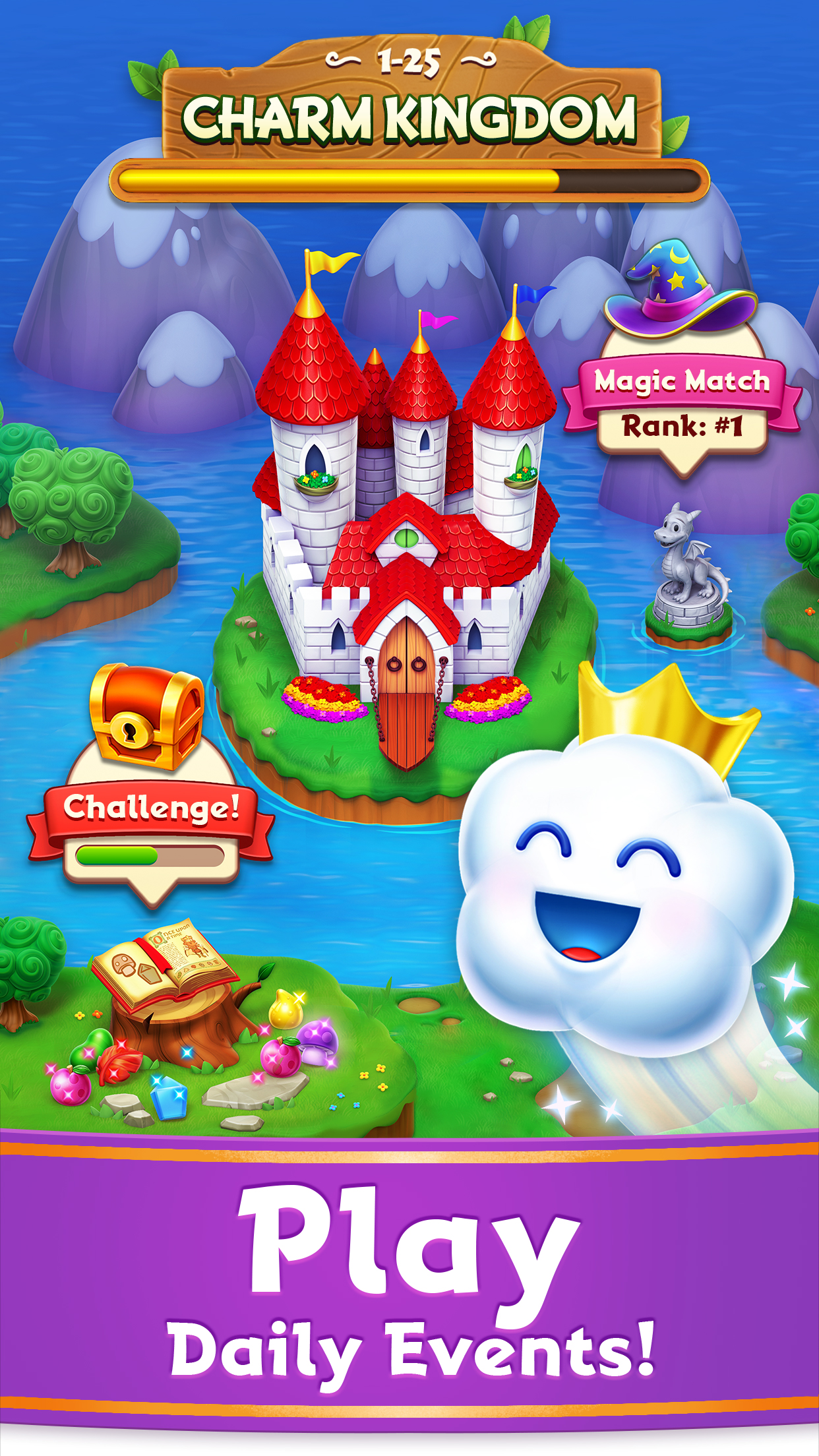
2018 Gameplay Screenshot
2019 Gameplay Screenshot
Features: Tournaments
Secretly, I am actually quite fond of the 2018 final screenshot. Unfortunately its in the final placement of the lineup - which gets the littlest engagement. I think this design definitely conveys the idea of exciting boost filled gameplay.
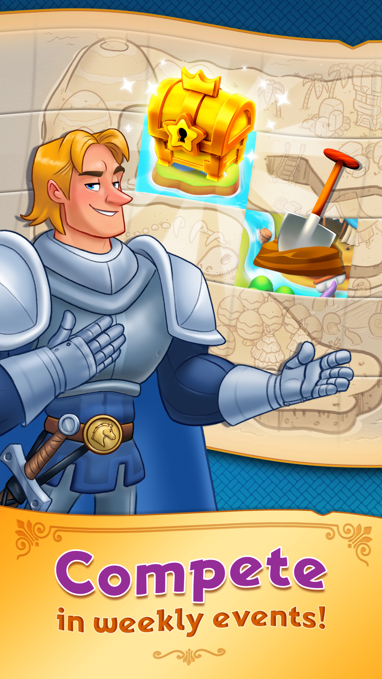
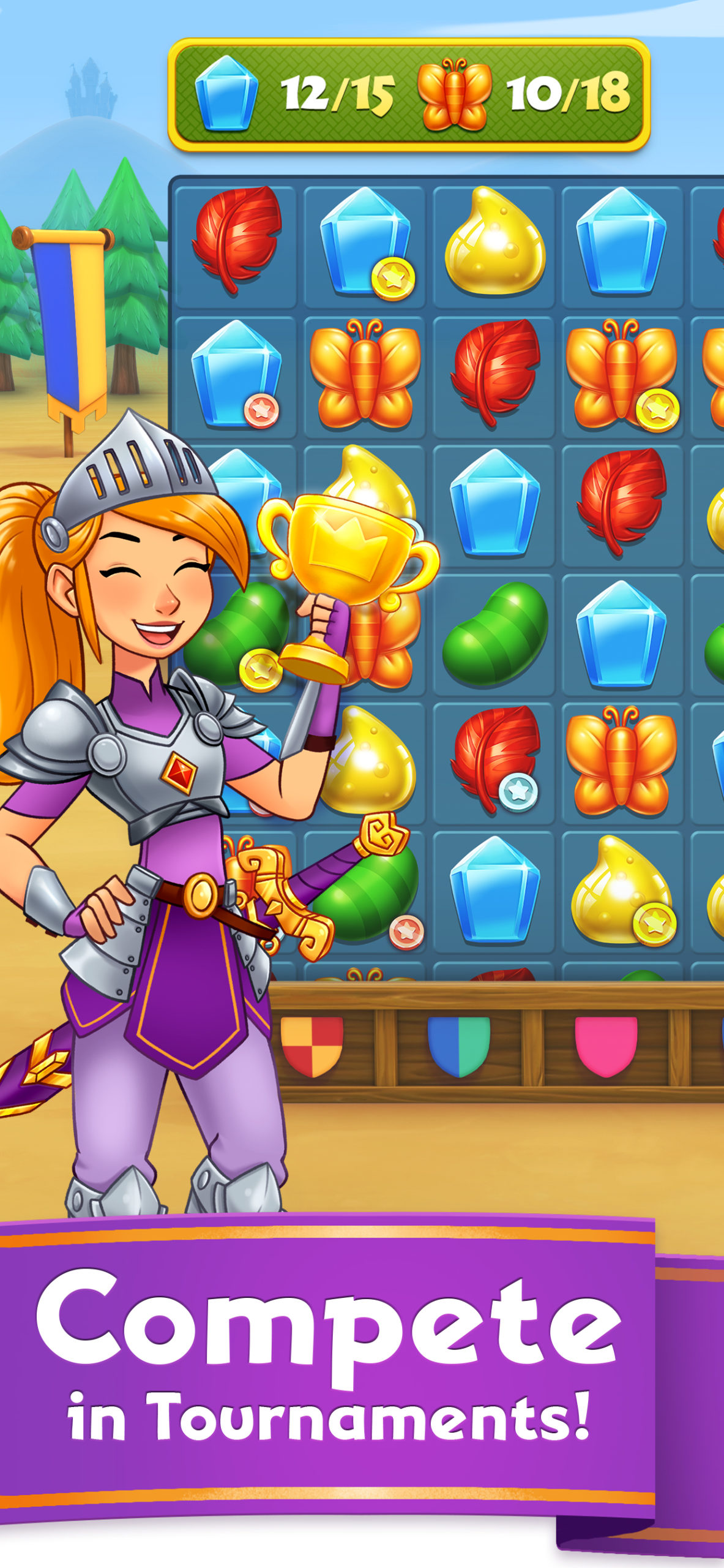
However, for the 2019 gameplay, we decided we wanted to highlight Tournaments. This last design was a it of a wildcard - but we decided to feature the rewards of the tournament as well as the leaderboard UI from our game. I even got to sneak my mom's name at the top of the board!

2018 Gameplay Screenshot
2019 Gameplay Screenshot
Final Touches and Final Lineups
Ultimately, I am very satisfied with our final lineup and production process. As a team we had improved on each screenshot design to clearly showcase the best aspects of our game. The visuals and copy paired nicely together, and each screenshot now featured a Core Cast IP character. The stakeholders were thrilled with the final designs, and approved them immediately.
I had taken care to build each PSD with my signature modular approach, so resizing in our standard 4 sizes, and localizing into our 13 languages was a breeze!
The final screenshot lineup was implemented early April 2019, and went live with the launch of Charm King 6.0. This lineup can be seen on the Charm King Appstore Page in the Google Play Store and iOS App Store.
But Wait! Apple's Special Request
In Late 2019, when attempting to submit a build, Charm King was flagged by the appstore review team for it's screenshots. The concern by the appstore was that screenshot 2 and 4 did not accurately reflect our gameplay footage, and needed to be revised immediately for our build to be approved.
I was tasked with creating 2 replacement designs with full resize's and localizations so we could submit on time - collapsing a process that took several weeks into a single day. This was only possible because of all the incredible process work we had done as a team to establish a pipeline and process for addressing appstore requests.
In testing, these designs did not show significant lift compared to our original lineup - so these speciality screenshots have only been implemented on the iOS store. I still favor the original designs over these ones!
Take a look at Another Project!
Gaming the System: Marketing as a Game DesignerGame Design and Marketing
PuzzlescapesUI/UX & Game Design
Charm King Screenshot Redesign (2019)Graphic Design & Branding Case Study
Signs of the Sojourner TrailerTrailer Editing and Design
Artwork & MerchandiseGraphic Design & Illustration
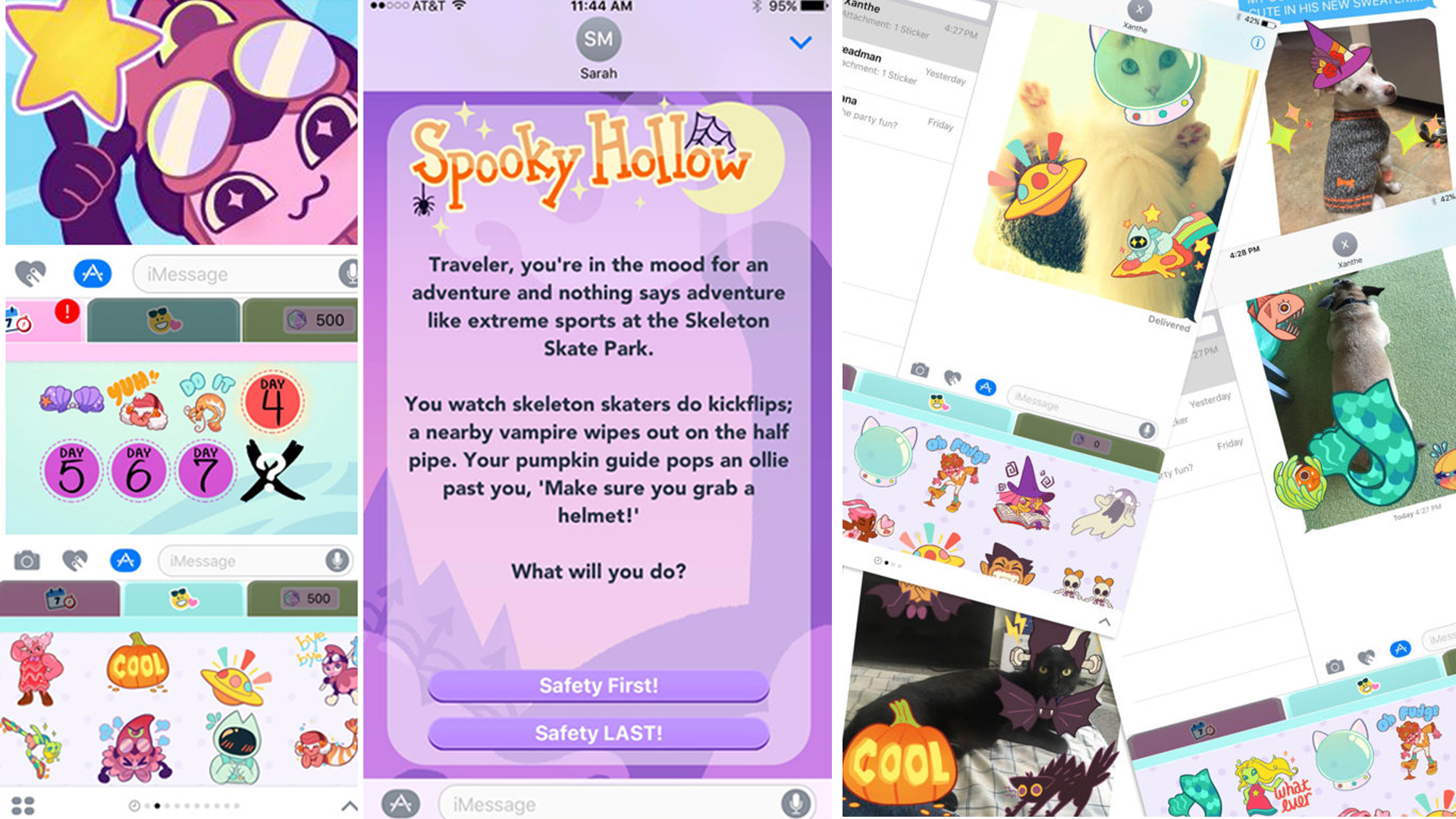
Sticker QuestUI/UX & Game Design
Atomic Lollipop Convention PromoTrailer Editing and Design
Appstore AssetsGraphic Design & Marketing
POV Entertainment AdsGraphic Design & Motion Design

The Arcana - TrailerTrailer Editing and Design
Style and Branding GuidelinesBranding and Marketing